Building Design Foundations
Design system for form and function
Rockstar’s website has to do two things at once: tell big, cinematic stories and handle a ton of real content and edge cases. Working on it let me go deep on details like motion, gradients, and interaction patterns—while also building a system that teams can actually use.
Below are a few of the most important problems I worked on while helping shape the Foundry design system for Rockstar Games and related web projects.
Tokens
Over time, we ended up with hundreds of gradient overlays for text on imagery—many of them almost identical, with no clear logic behind them. It made the UI inconsistent and hard to maintain. I led an overhaul of these gradients.
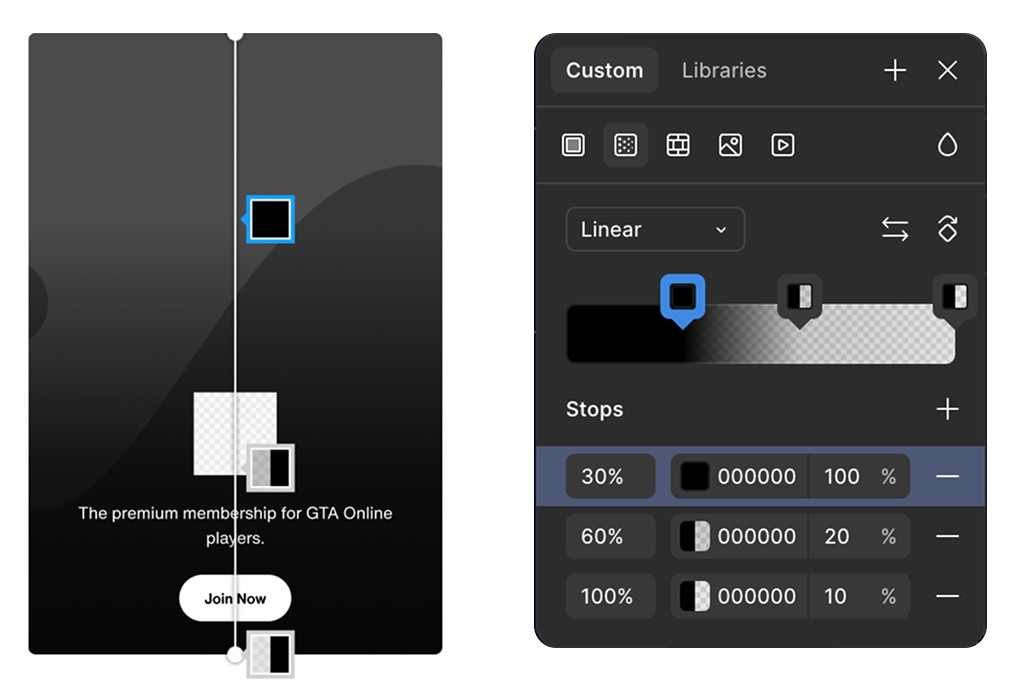
The tokenized gradient
We defined a single mask structure with clear color stops and one base color. In Figma, designers can now quickly tune a gradient to match the image’s tone instead of defaulting to flat black. In code, this collapsed a pile of one‑off gradients into one predictable, tokenized value.
The gradient token applied to different cards
For the GTA 6 marketing sites, we introduced six color themes, each tied to a different character story.
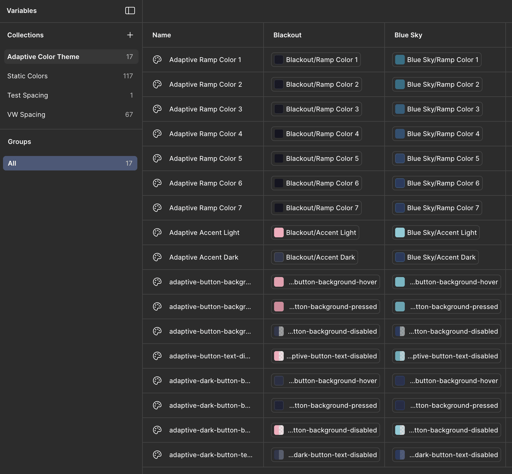
Adaptive color theme variables
I created the foundations for these themes so they would scale. Backgrounds, buttons, and states all pull from the same set of adaptive color variables. That keeps the experience consistent across pages while giving each story a distinct visual voice.
Theme switching in Figma
Components
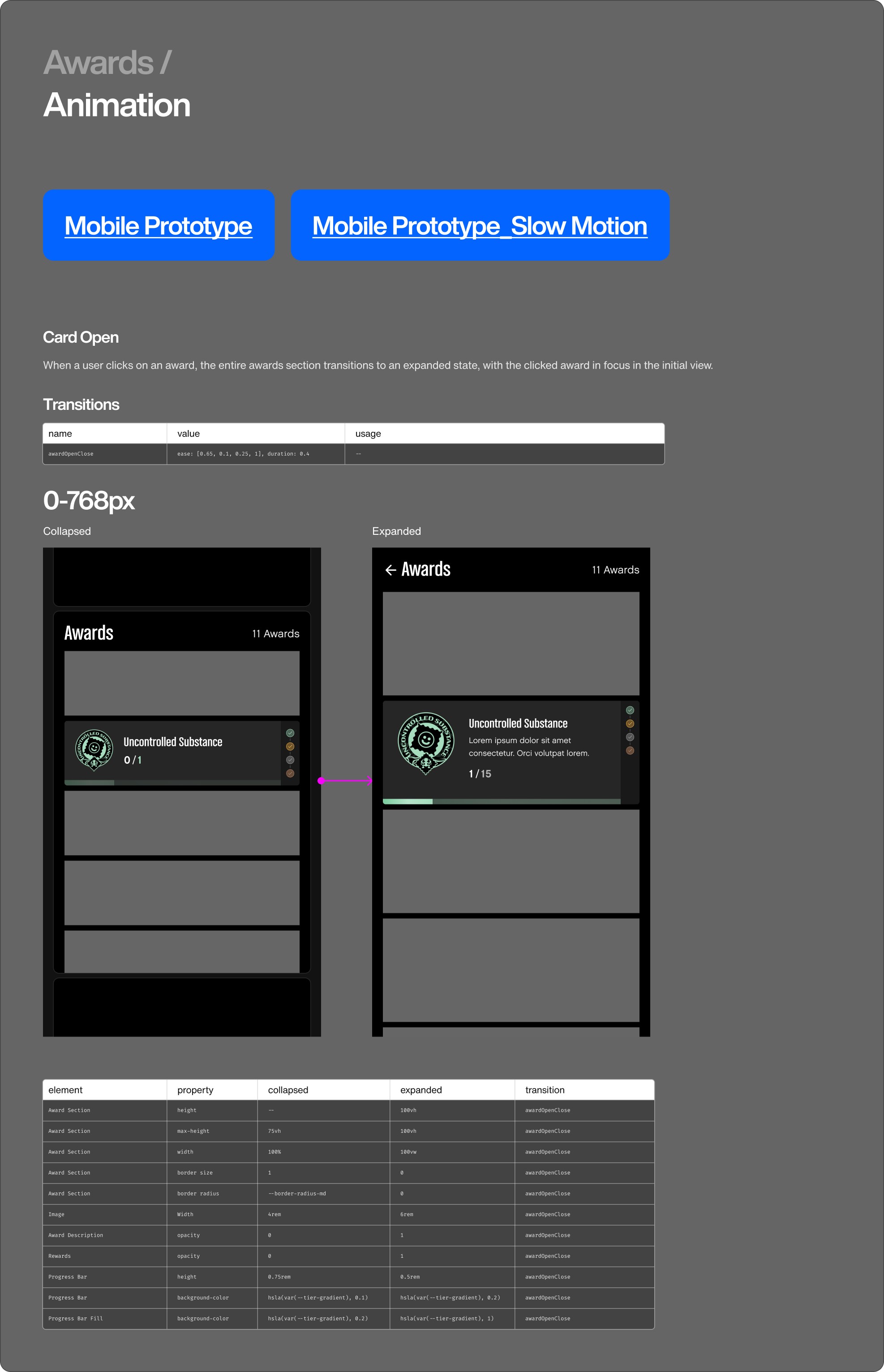
Components on Rockstar sites have to work across multiple breakpoints, layouts, and content types. As we moved away from static, bespoke pages toward reusable building blocks, component quality mattered a lot more. One example is the GTA Online Awards progression experience. There were 250+ awards, each with multiple states. To make this manageable, I started with an audit of all awards and defined the core anatomy of an “award” component.
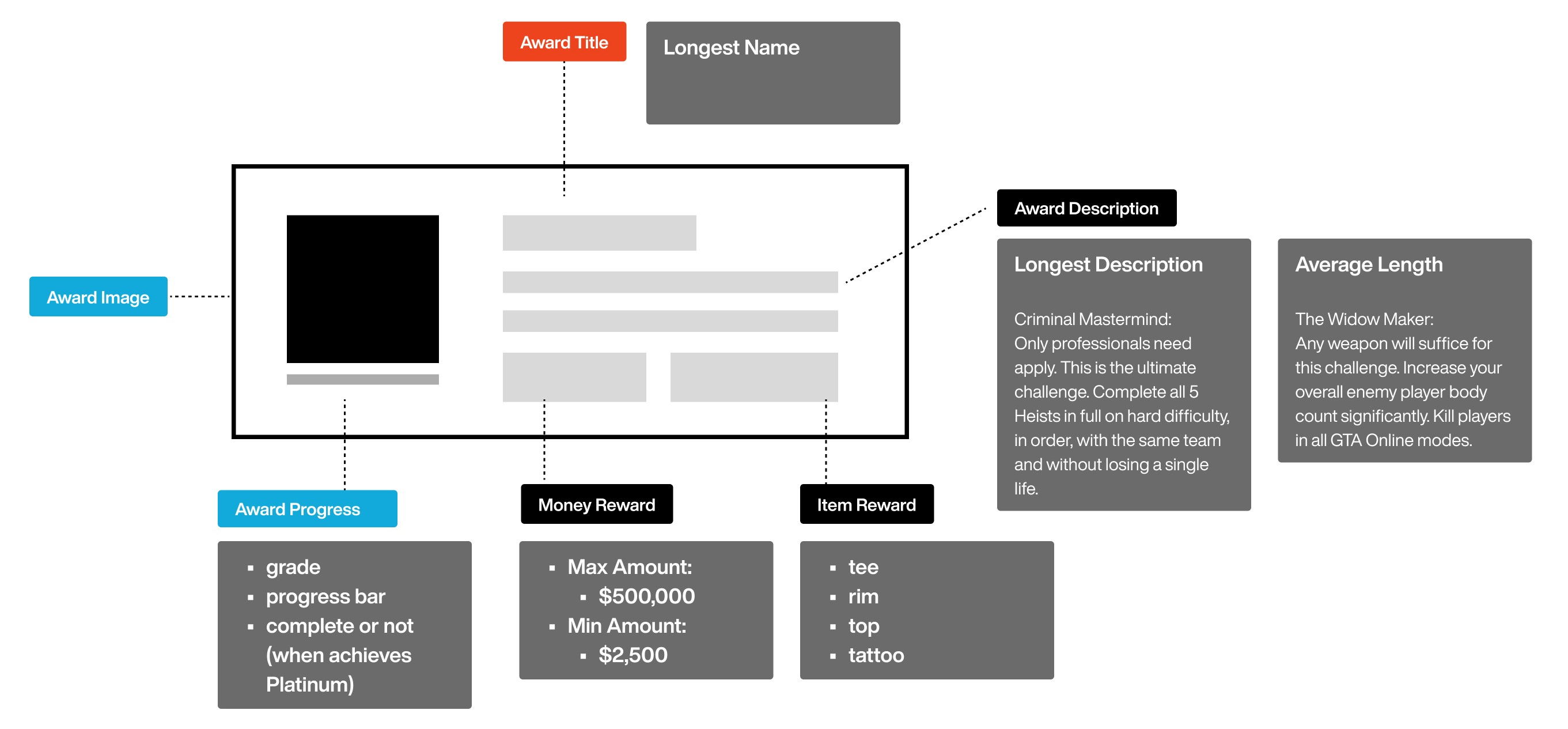
Anatomy of awards component
This kicked off a conversation with developers to define which metadata we could reliably surface for players.
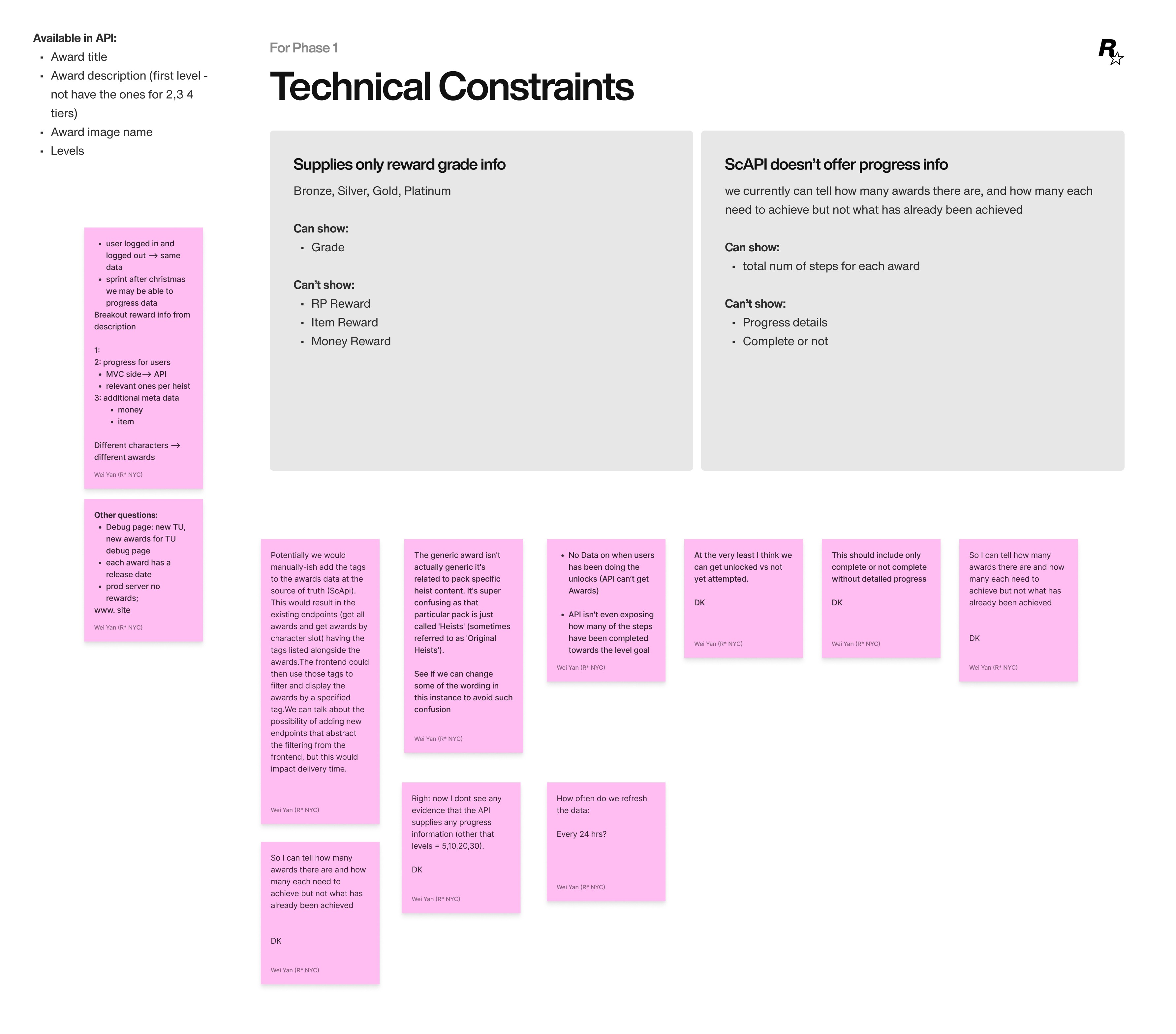
Mapping what the API could actually deliver
Once we agreed on the underlying data, I mapped that into a component structure and wireframe based on the available APIs.
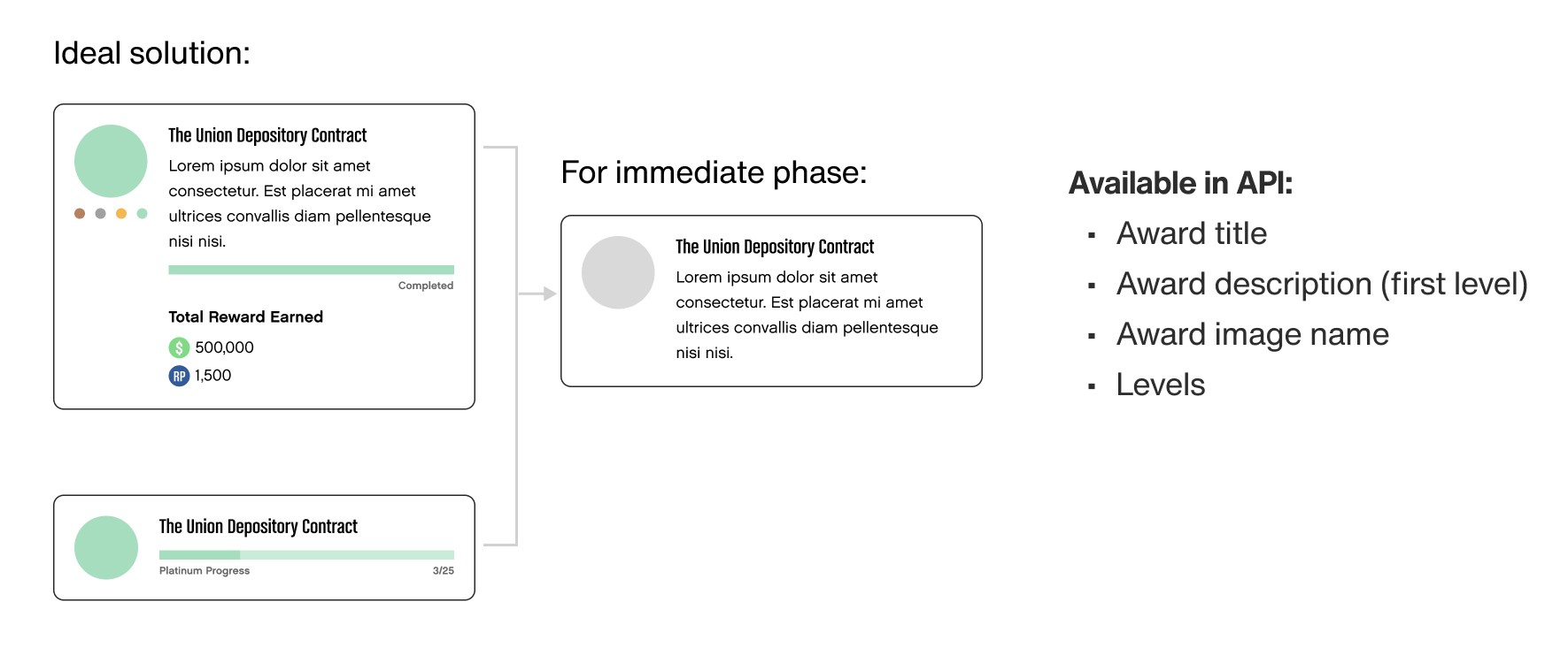
Component wireframe based on APIs available
From there, I placed the components back into real page contexts and focused on how players would actually interact with them.
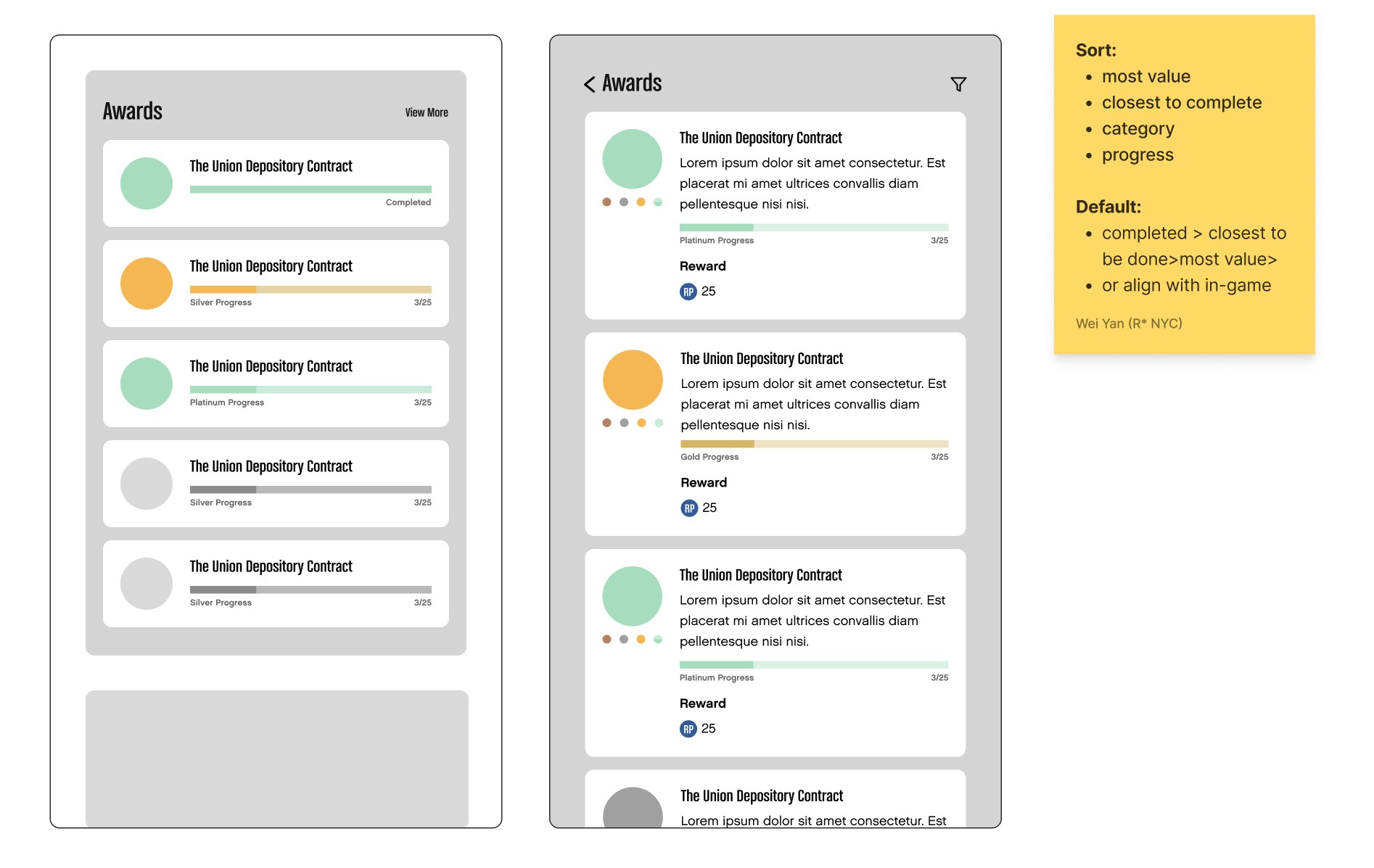
The collapsed state for high-level progression; the expanded state for detailed instruction.
We defined a collapsed state for high-level progression and an expanded state for detailed instructions. I built quick prototypes to test transitions, timing, and interaction patterns, then iterated until the reveal of information felt right.

Quick prototypes to test and fine tune transitions
Once the strategy for how information appears was solid, I locked down visual variations using a small set of key colors. These colors later became the foundation for color logic in other components. I created color sets and validated them for accessibility to ensure they worked across all states and backgrounds.
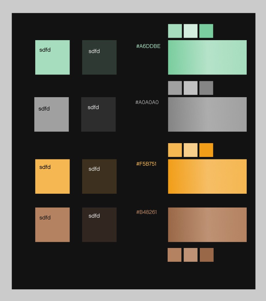
Four color sets validated for contrast across all states and backgrounds
With the structure and colors in place, I finalized the component with typography, spacing, and responsive behavior.
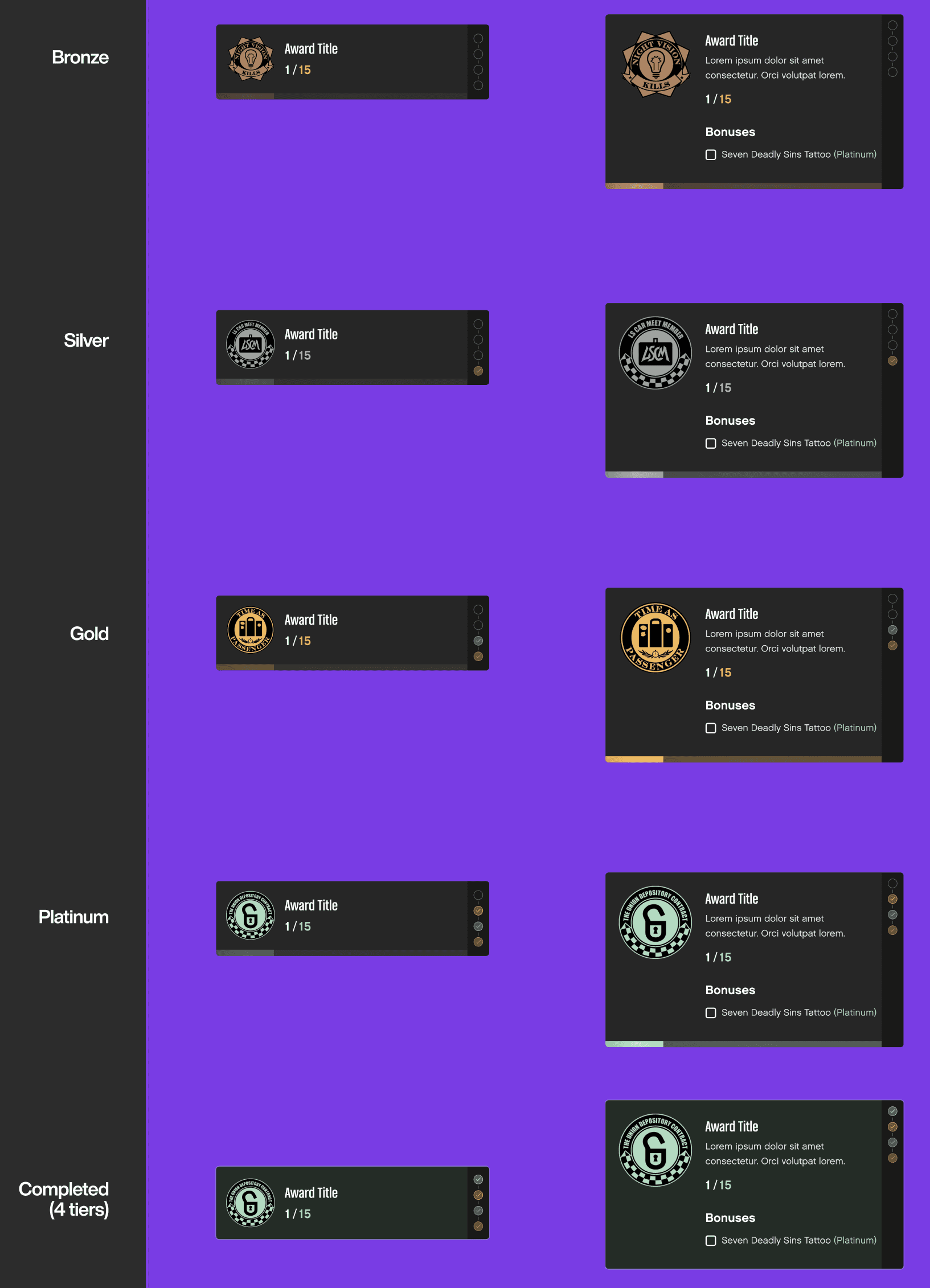
Finalizing components with the color sets and typography
Now everything is in place, we created a final interaction with the high-fidelity UI. Finally, I documented the high-fidelity interaction so the implementation matched the intended feel.
The component as it ships
As we added more motion to the site, it became important to document the “character” of the animations: timing, easing, and how different elements move. I captured these as part of the global design system, so animations across pages and products feel like they belong to the same brand—not a collection of one-off effects.
Animation documented as part of the global design system
Template
Rockstar has many franchises—Red Dead Redemption, Grand Theft Auto, Bully, Max Payne, and more. Defining how each IP keeps its own identity while still feeling like Rockstar was a big part of the work. For Get the Game templates, we built a flexible base that can take on different looks.
Same underlying structure, different visual character, driven by content and key art
The goal was to empower creators: keep the template simple, let content and assets do the heavy lifting. Every game page feels like its own character, but they all sit on the same underlying system. The hero template is another good example of my approach to website systems: start with a strong, reusable structure, then layer in brand and story through content, motion, and color.
Same structure and CTA logic, reskinned through art direction, motion, and color
We used the same approach for the Rockstar Games homepage. We built it from templates and components that content teams can reuse and remix without breaking the system.
The Rockstar Games homepage — built from reusable templates and components
For each template, component on the homepage, we document them and translated to data model that works for the new CMS system. The CMS now manages the entire Rockstar Games website in a way that is flexible for content creators and consistent for players.
Every template and component translated into a CMS data model
Acknowledgments Some of the components and design tokens were initially built by me, then handed off to Matt and Natalia, who specialize in design systems at Rockstar Games. I don’t work directly on the core design system team, but a key contributor from the website side.