QA:
Weeks → Days
No gradients tuned case by case
Design Specs → Runtime Logic
Engineering consumes structured color data
Taste as Infrastructure
Turning subjective visual judgment into scalable behavior
My role
I led the design of a media-first gradient system focused on how interface layers sit on top of high-fidelity game assets. I worked across design, art, content and engineering to translate Rockstar aesthetics into a consistent, implementable system.
Impact
QA cycles compressed from weeks to days. Non-designers can update gradients through a single input model. It later scaled to the GTA VI trailer site, where gradients became a core storytelling layer, guiding narrative transitions through scroll.
The media is the product
At Rockstar, image or video isn't decoration. It is THE experience. A character portrait, a vehicle, a scene from gameplay, or a detail from the world is what pulls players in. But media still needs content layer to retain a sense of purpose: title, navigation, calls to action. The challenge was to present the content without obscuring the media in the background.
When that layering goes wrong, it doesn’t just look off, it breaks the experience itself.
When layering breaks the experience
To make content layer readable, we applied uniform gradients across assets. Standard practice. Black gradients made everything legible, but flattened the image, muted key details, and sometimes covered the very thing meant to attract players. Feedback came back consistently: “This is fighting the asset” “This feels too heavy”.

Gradient breaking visual cohesion

Gradient covering key content
"Too heavy" sounds like a personal taste, not actionable on its own. It could mean opacity, coverage, placement, or all of them at once. What looked like a simple tweak exposed a deeper issue:
This wasn’t a visual polish problem. It was a system that couldn’t translate taste into decisions.
Making taste actionable
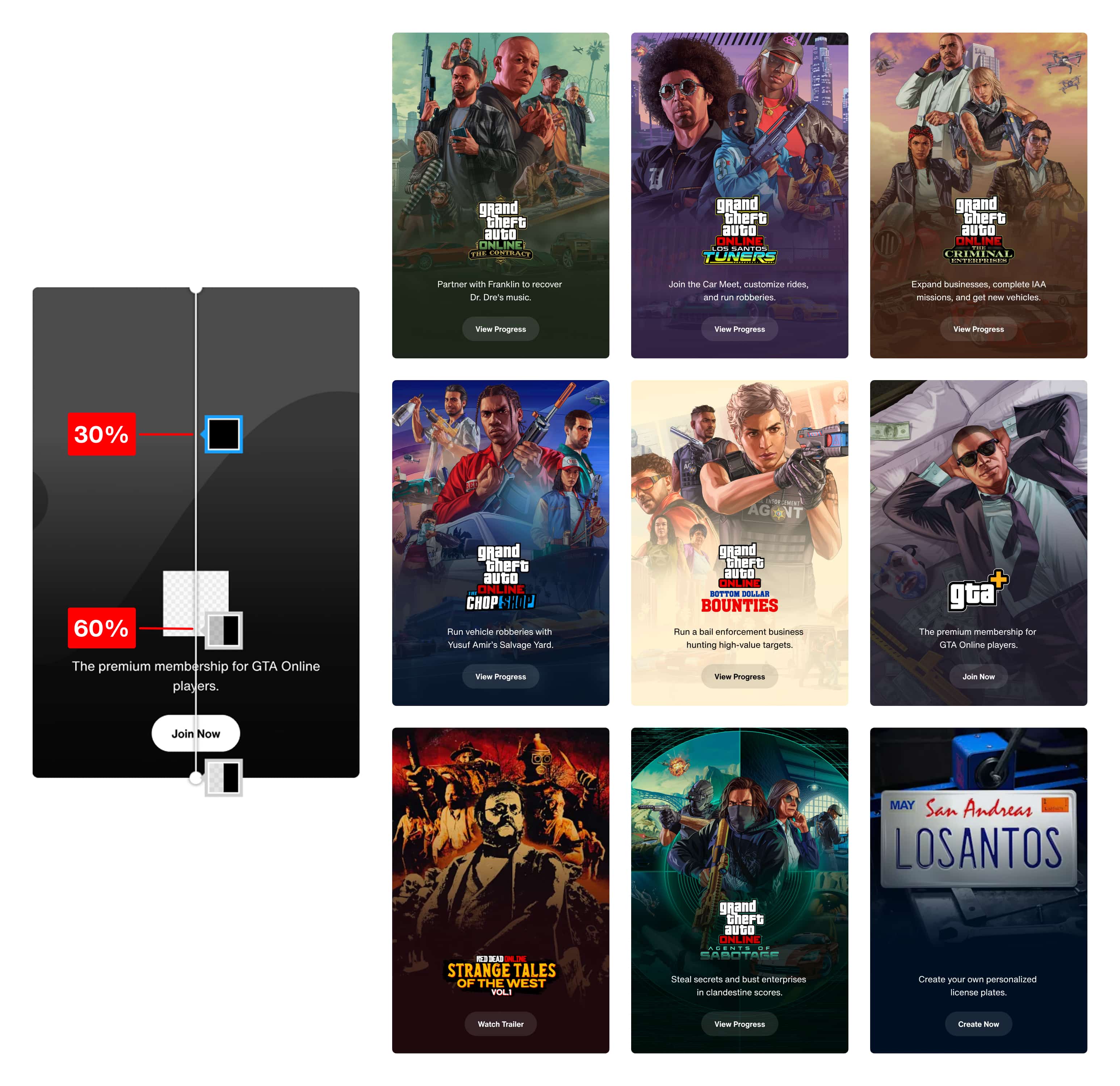
If the problem was translation, the first thing was to find a place where visual decisions could be compared and made consistent. I started with card components — fixed aspect ratio, consistent content structure — trying to answer: what actually makes a gradient "too heavy" or "fighting the asset"? I broke it into measurable decisions:
how much of the image is covered
where readable area sits
how the gradient interacts with the focal point
Gradients moved from heavy, uniform overlays to image-aware layers
From that, I defined working rules:
gradients cover 40% of the image
readable content sits within a ~20% vertical band
key visual elements stay outside that zone
gradient color adapts to the asset
This turned vague feedback into something actionable.
Making taste operable
The rules worked. The composition held together better. We solved it visually, but not operably. Engineers concerned "Customized color for each asset? This is going to explode in complexity". They were right to question it will quickly turn into inconsistency and maintenance overhead. Also, from content side, question became "who decides the gradient color?" If every asset required design input, the system wouldn’t scale.
At this point, the problem shifted from "what makes a gradient work?" to "how do we make this work operable by different teams?"
I unpacked the problem into two aspects: what gets controlled by system and what by editor/human?
SYSTEM-CONTROLLED
Gradient behavior
how much of the image it covers
how it fades
where the gradient starts and ends
EDITOR-CONTROLLED
Color input
a single color selected in CMS
Then I materialize the decision, and that formed how CMS functions. Editors provide a single color input. The system derives all gradient behavior—coverage, fade, and positioning—ensuring consistency without requiring design intervention.
No custom logic per asset. Consistency without rigidity.
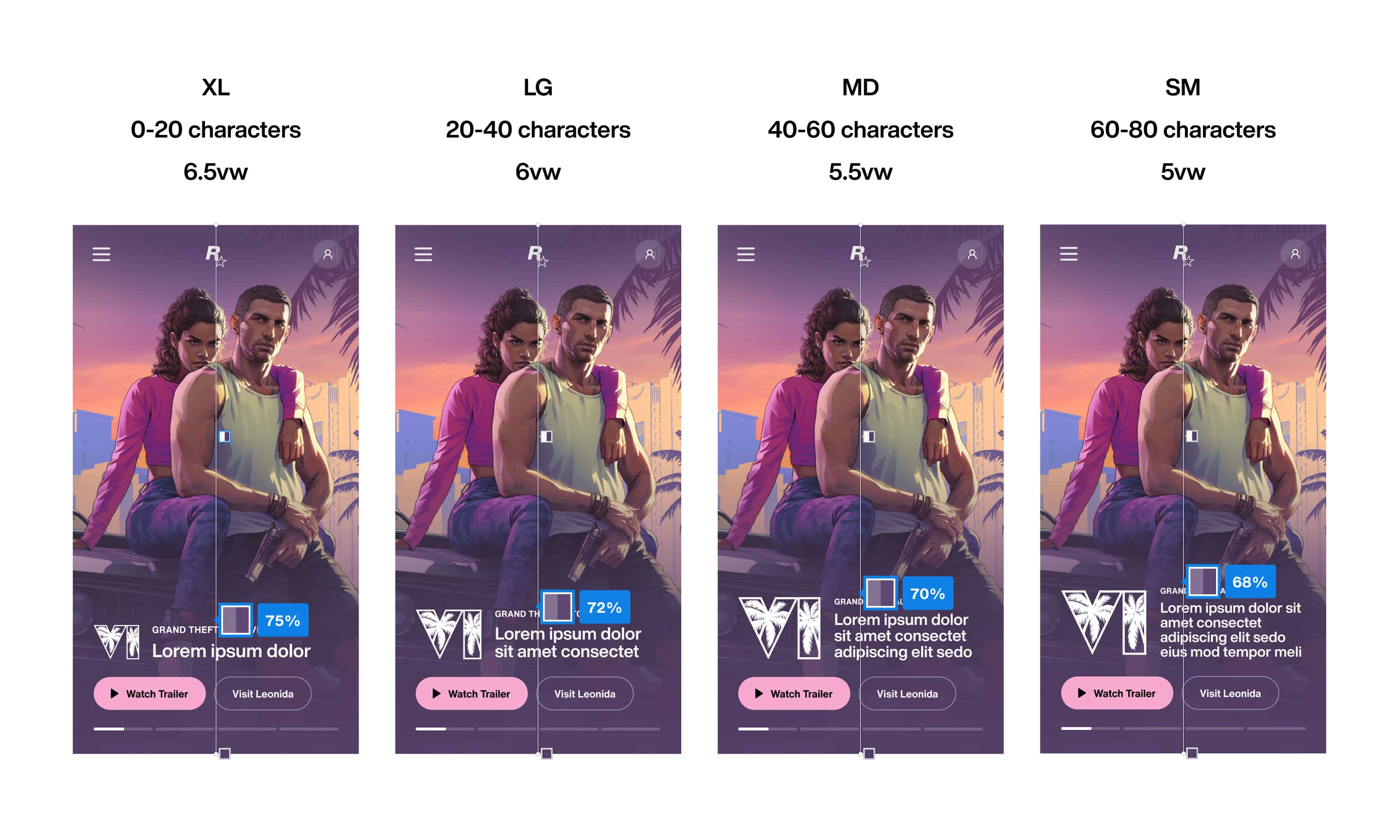
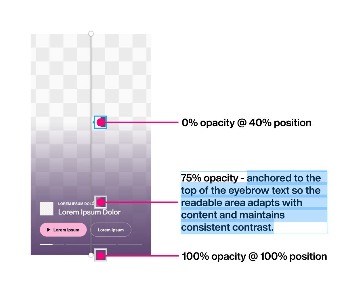
Readable area varies with content. Fixed percentages break as layouts scale
Instead of tuning values, we shifted to relationships: anchoring gradient behavior to the content layer so it adapts with the layout.
Figma let us define the gradient as fixed percentages. It couldn’t express what we actually needed: a gradient that adapts to the text. That exposed a deeper issue in how we communicated.
Readable area varies with content. Fixed percentages break as layouts scale
Specs based on static values led to constant clarification. That's when I stopped prescribing values and started defining intent.
That shift turned implementation into a shared problem, moving conversations from “what number?” to “how should this behave?” Since then, intent has become the baseline for how we spec and communicate, prioritizing behavior and rationale over prescribed values when working with engineering.
What the system made possible
On the GTA VI trailer site, gradients took on a new role. We rolled out six places. Six distinct tones. We used gradients to carry that difference.
Change base color, and the gradient geometry takes care of the rest.
This time, we didn't design six times, we applied the same underlying system. All we do is changing one color input, each theme behaves the same, but feels different. All six use the same gradient angle — 223.17 degrees — so the perceived light direction stays consistent even as colors shift.
Gradient geometry held constant. Only the RGB of every stop move as users scroll.
Perceptually it feels like the world is changing color, not like one slide is replacing another, which is the mood we want for GTA VI world.
Gradients stopped supporting the page. They started connecting the experience.
Outcome
Treating the gradient as a small design system meant handing engineering a data structure, not a design file. An array of seven colors per section. The runtime does the rest. Palette in, scene out.
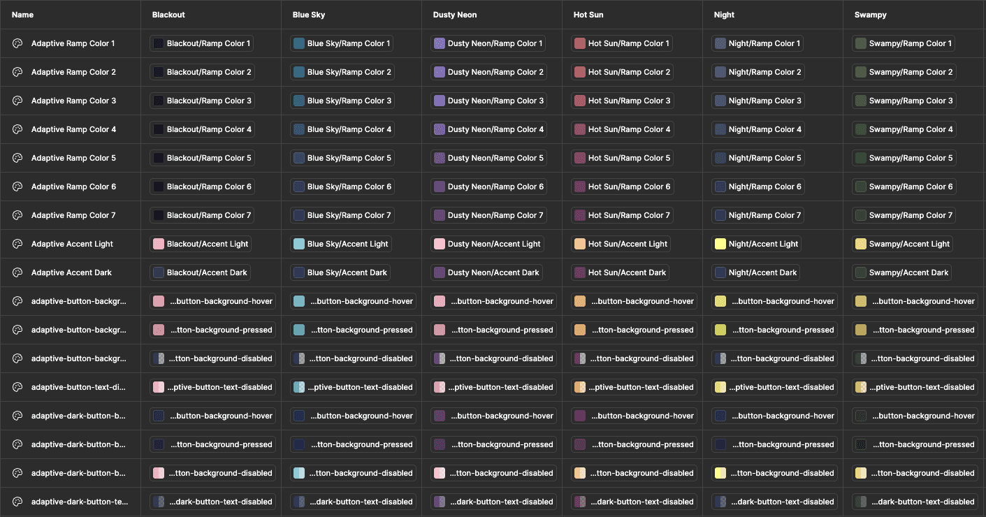
Each theme resolves into a reusable set of color ramps
Once the system was in place, QA cycles that used to take weeks compressed to days, because gradient decisions were no longer made case by case. Before this, feedback like "too heavy" wasn't actionable. Turning that into a system made it usable.
BEFORE
gradients tuned case by case
subjective feedback loops
QA cycles stretched across weeks
AFTER
consistent behavior, every asset
editors update independently
QA dropped from weeks to days
REFLECTIONS
Building from first principles
This started as a gradient that felt off on a card. It became a connective layer across an entire product. What surprised me was how much range the system had once gradients became scroll-driven. Once scroll position becomes the clock, it can drive anything that changes smoothly: color, angle, blur, opacity. The result can feel visually new, but it comes from a simpler place: a small set of primitives and relationships, applied consistently. That's what made taste workable. A gradient that "feels too heavy" is abstract until you reduce it to what it actually controls — how much it covers, where it sits, how it moves. The subjectivity just gets a structure the team can reason about together. A lot of “how did we do that?” effects collapse into the same idea:
Pick one primitive, use it consistently. Let it scale further than you planned. That's how you translate taste into a system others could use.
Acknowledgement A few people made this system sharper. Matthew Alessandri asked the right question at the right time: "Is there a rule for all these logo sizes?“ That question led to a more consistent readable area across cards and, unexpectedly, simplified the gradient logic itself. Bobby Marcus pushed me to think about gradients as something the browser actually has to render, understanding the implementation cost led us toward a simpler, more efficient solution.